-
Notifications
You must be signed in to change notification settings - Fork 45
Parameters for configuring themes
Anirudh S edited this page Mar 17, 2015
·
3 revisions
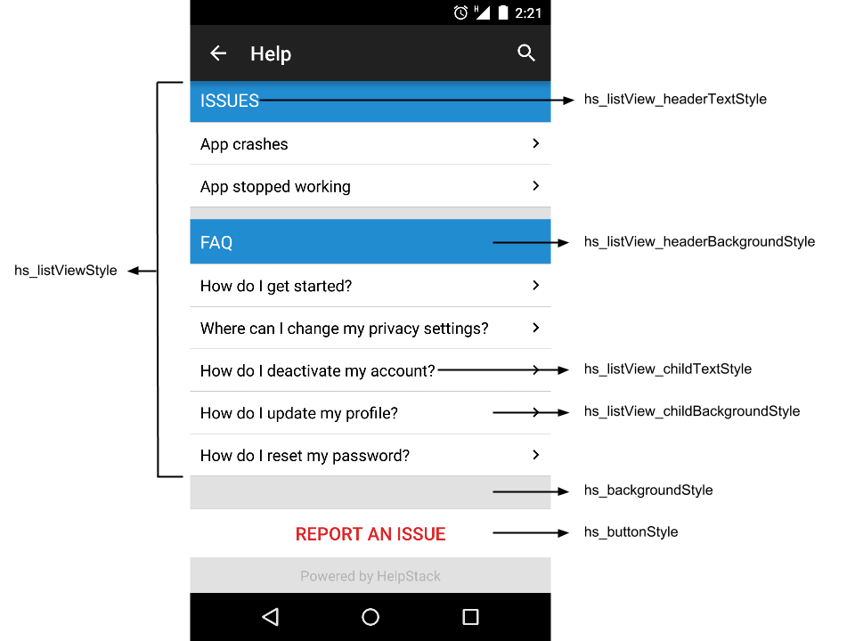
Below is the list of parameters you can configure to change the looks of HelpStack:


- hs_backgroundStyle - Background of all screens
- hs_listViewStyle - Articles and issues list
- hs_listView_headerBackgroundStyle - Header background of main list view
- hs_listView_childBackgroundStyle - Child view background of main list view
- hs_listView_headerTextStyle - ListView header text
- hs_listView_childTextStyle - ListView child text
- hs_leftChatBubbleStyle - Chat screen - left chat bubble style
- hs_rightChatBubbleStyle - Chat screen - right chat bubble style
- hs_left_messageTextStyle - Chat screen message text style for left chat bubble
- hs_right_messageTextStyle - Chat screen message text style for right chat bubble
- hs_smallTextStyle - Chat screen more info text style - applied to the sender name and time
- hs_buttonStyle - Button Style - applied for report issue button
- hs_editTextStyle - Edit text Style in new user and new issue screen
- hs_messageEditTextStyle - Edit text Style used in chat screen - add reply
Override the styles specified in /values/hs_custom_theme.xml
All the icons used in the HelpStack UI are defined under Drawables in the hs_custom_theme.xml file. In order to include your own icons, download and add the icons in your applications resources, and override the drawables specified in the theme for the UI to take up your own icons.
Below are the icons used in HelpStack UI :-
- hs_attachment_icon - Attachment icon used in issue detail screen and New Issue screen
- hs_search_icon - Search icon used in the action bar
- hs_disclosure_next - Disclosure icon used in the main list view child item
- hs_add_attachment - Add attachment icon used in issue detail screen, to add an attachment